

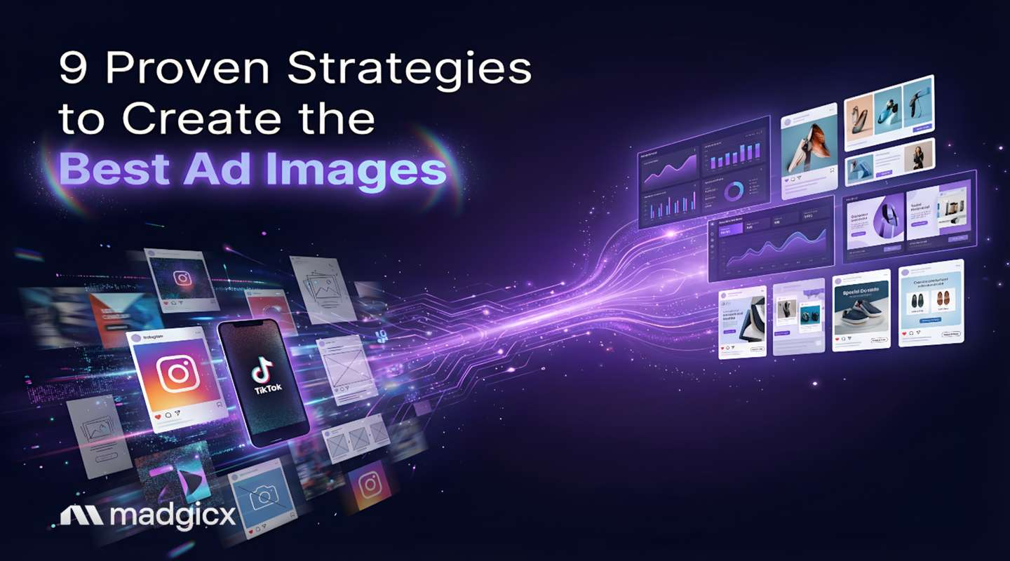
Think Your Ad Strategy Still Works in 2023?
Get the most comprehensive guide to building the exact workflow we use to drive kickass ROAS for our customers.


It’s the end of the quarter. You're staring at a client’s ad account, and the numbers just aren't adding up. The copy is solid, the targeting is dialed in, but the ROAS is flat. Sound familiar? We've all been there. You dig through Ads Manager, and there it is—the culprit hiding in plain sight: a portfolio of ad images approved based on gut feelings, not data.
So, what separates a money-pit image from a money-printing one? The best ad images are simple, high-quality visuals that use on-brand colors and minimal text to make one thing—the product or its outcome—the undeniable hero. They’re also perfectly sized for platforms, like 1080x1080 for feeds and 1080x1920 for Stories, so they look sharp and stop the scroll instantly.
For agencies, this isn't just a performance issue; it's a retention risk. You need a reliable system to create and prove the value of winning ad images, not just a gallery of pretty examples that make the client feel good. You need a creative engine designed to drive profitability. This guide is our framework for turning that principle into a repeatable, profitable process for every client you manage.
Let's get one thing straight: video is powerful, but it's not the only hero in your creative arsenal. In the rush to produce the next viral Reel, many agencies overlook the sheer power of a single, brilliant static image. We see it all the time—a simple, well-designed static image outperforming a slick, expensive video by over 2x on ROAS.
Why? Because a static image delivers its message in a fraction of a second. There's no "watch time" required, no need to wait for a hook. It's an instant hit of information and emotion. 💥
Pro Tip for Agencies: Static images are your secret weapon for efficiency. They let you run faster, more budget-friendly creative testing cycles. You can test ten different image concepts for the cost and time it takes to produce one video. For an agency juggling multiple client accounts, this speed is a massive competitive advantage.
Alright, let's build the foundation. These aren't just "nice-to-have" tips; they are the core principles that separate amateur ads from professional, performance-driving creative. Use this as a checklist for every single image that leaves your agency.
Let's start with the basics, because this one is non-negotiable. A blurry, poorly cropped image screams "unprofessional" and kills trust. For example, square images with a 1:1 aspect ratio consistently show better engagement on feeds.
Always export your images as high-quality PNGs or JPEGs. No excuses.
When someone sees your ad, what's the one thing you want them to look at? A great ad image has a single, undeniable focal point. The human eye is drawn to clarity and repelled by chaos. Don't try to cram three products and a block of text into one image. Pick one hero and let it shine.
Color isn't just for making things pretty; it's for persuasion. The Pantone Color Institute reports that up to 90% of snap judgments about products can be based on color alone.
Use your client's brand colors strategically to match the campaign's emotional goal.
Which corner should the logo go in? Research from the Nielsen Norman Group found that users are 39% more likely to remember a brand when its logo is placed in the top-left position. Because we read left-to-right, placing the logo where the eye naturally starts reinforces the brand from the first millisecond.
The age of glossy, perfect stock photos is over. Authenticity builds trust, and trust drives conversions. Lean into User-Generated Content (UGC) or UGC-style photography. A slightly grainy iPhone photo of a happy customer often outperforms a high-budget studio shot because it feels genuine.
While Facebook's 20% text rule is gone, the principle is still golden. Your image is for visual impact; your headline and ad copy are for the message. If you must use text, use 3-7 words, max. Think "50% Off" or "New Arrival." Ensure high contrast so it's readable on a tiny screen.
Your ad image's first job is to be a visual speed bump that breaks the monotonous scroll. How? Use bold, contrasting colors, show something unexpected, or use human faces making eye contact. We are biologically wired to look at other faces. The goal isn't just to be seen; it's to be noticed. Mastering these principles is a core part of effective advertising design.
This is the golden thread of conversion. The image, ad copy, headline, and landing page must all tell the same, consistent story. If your ad image shows a red dress, the landing page better feature that same red dress front and center. Any disconnect creates cognitive dissonance and kills conversion rates.
This should go without saying, but it's critical. Using images you don't have the rights to can land your agency and your client in serious legal trouble. It's estimated that 85% of the 3 billion images shared online daily are used without permission. Use reputable stock photo sites, get written permission for all UGC, and use your own custom photography whenever possible.
The best concept depends on your client, your offer, and where the customer is in their journey.
This is content that looks like it was created by a real customer. It's authentic, trustworthy, and perfect for building social proof.
Clean, simple, and straight to the point. This is your product on a plain background, looking its absolute best.
This image doesn't just show the product; it shows the outcome of using the product. It sells the destination, not the airplane.
With Madgicx’s AI Ad Generator, you can turn a simple product photo into polished, lifestyle-style ad creatives without manual design work. Upload your basic image, and the AI generates multiple visually enhanced variations that place your product in high-converting, real-world contexts. These creatives are delivered in batches, giving you dozens of ready-to-launch options to test across funnels.
This is a design-heavy image where the text and graphics are the main event. The focus is 100% on the promotion itself.
Based on the image types above, choose 2-3 concepts to test. Form a smart hypothesis. Example: "We believe a UGC-style image will get a lower CPC than Lifestyle because it feels more native."
Test one thing at a time. Keep the headline, primary text, and audience identical across all ads so you know the image was the reason for the performance shift.
Use Campaign Budget Optimization (CBO). The algorithm will automatically push budget toward the best-performing ad, giving you a clear signal of the winner.
Pro Tip: Iterate on the winner. Change the background color or text overlay of the winning image to turn a single win into a long-term strategy. 🚀
Once you have a winner, scale intelligently. With Madgicx's AI Chat, you can ask: "Which of my active images has the highest ROAS this week?"
Wait until each ad has exited the "Learning Phase" (~50-100 events). For lower budgets, look at CTR and CPC after 3-4 days for leading indicators.
Run an A/B test. Use the Madgicx One-Click Report to show side-by-side performance on ROAS or CPA.
CTR for prospecting (awareness); ROAS for the bottom line. A high CTR with no conversions is a vanity metric; always align with the business objective.
Start with one core image and change one element (background, crop, or text). You can also use ad creative services to produce variations at scale.
Yes. Tools like the Madgicx AI Ad Generator can create high-quality variations based on product images in minutes.
Stop treating creative like a subjective art form. By combining these 9 best practices with a systematic testing framework, your agency can create a scalable system for increasing client ROAS.
Ready to see what's really working? Use Madgicx to analyze creative performance and turn insights into profit.
Stop spending hours designing and refining ad visuals manually. Madgicx’s AI Ad Generator transforms basic product photos and performance insights into polished, high-converting ad images at scale. Generate batches of launch-ready creatives in minutes and give your clients consistently strong visuals to test and scale.
.avif)
Digital copywriter with a passion for sculpting words that resonate in a digital age.


