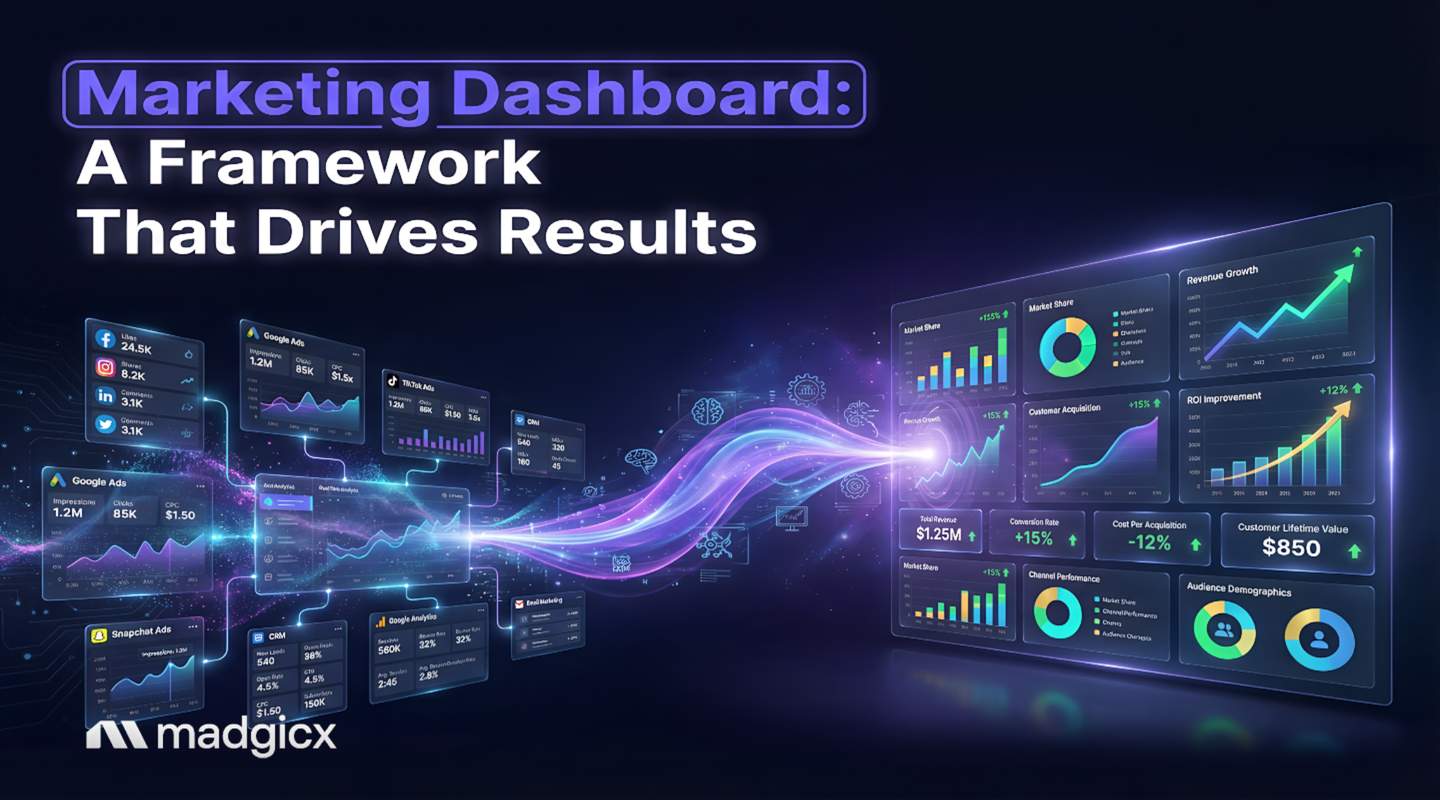
A marketing dashboard is a visual reporting tool that consolidates key metrics from multiple channels into a single view. But an effective one is a strategic command center that helps you make decisions 5x faster.
So why do studies show that 40% of marketing dashboards are considered failures by their users?
The problem isn't the concept—it's the execution. Too many dashboards are just pretty graveyards for data. If you're tired of exporting data to spreadsheets because your dashboard doesn't provide real answers, you're in the right place.
In this guide, we're handing you a battle-tested framework to build a marketing dashboard that actually works. We’ll tackle today's biggest advertising challenges—from iOS signal loss to using AI for predictive insights—so you can finally get answers, not just more questions.
What You'll Learn
- Why 40% of dashboards fail and how to avoid common pitfalls
- How to design specific dashboards for the post-iOS 14.5+ tracking environment
- 15+ actionable dashboard examples for e-commerce, agencies, and performance marketers
- A 5-phase process for building a dashboard from scratch in under 4 weeks
- How to integrate AI for performance alerts and automated insights
The Crisis: Why 40% of Marketing Dashboards Fail
We’ve all seen them. Dashboards packed with every metric under the sun, flashing colors, and so many charts it looks like a Jackson Pollock painting.
They look impressive, but when you actually need to know why your CPA just doubled, they’re useless. This is the core of the crisis: most dashboards are data dumps, not decision-making tools.
In fact, some industry pros are already sounding the alarm, with 43% of SaaS professionals believing dashboards are dying because of how badly they're built. It’s not the tool’s fault; it’s the strategy (or lack thereof).
Here are the three horsemen of the dashboard apocalypse:
- The "Measure Everything" Trap: We’ve all heard "what gets measured gets managed," but this often leads to measuring everything. A dashboard without a primary goal is like a ship without a rudder. It’s full of information but has no direction, leaving you with a dozen vanity metrics and zero actionable insights.
- Stale or Untrustworthy Data: Nothing kills a dashboard faster than data you can't trust. When your team spots a discrepancy once, they’ll question everything forever. According to Data Slayer, 67% of users lose confidence in their analytics entirely when dashboards show outdated or incorrect data.
- The One-Size-Fits-All Mistake: A CEO doesn’t need to see the click-through rate of a specific ad creative. A channel manager, on the other hand, lives and breathes that data. Building a one-size-fits-all dashboard is a recipe for failure because it ends up serving no one well.
The Foundation: 5 Principles of a High-Performing Dashboard
Alright, enough doom and gloom. The good news is that building a dashboard your team actually loves and uses is entirely possible. It just requires a strategic foundation built on these five principles.
- Start with "Who Is This For?": Before you connect a single data source, this is the first and most important question. The metrics, layout, and level of detail should be tailored to the user.
- Executive View: High-level business outcomes. Think blended ROAS, Marketing Efficiency Ratio (MER), Customer Acquisition Cost (CAC), and Net Profit.
- Manager View: Channel-specific performance. Focus on campaign-level ROAS, CPA, budget pacing, and conversion volume.
- Analyst View: Granular diagnostics. This is where you get into ad-level CTR, frequency, audience saturation, and creative performance.
- Make Every Metric Actionable: Every single chart or number on your dashboard must pass the "So what?" test. If you see a metric, you should immediately know what action to take if it goes up or down. Instead of just showing "Traffic," show "Traffic vs. Goal." This transforms a passive number into an active signal.
- Keep It Clean and Simple: The goal is clarity, not complexity. A great dashboard guides your eye to what matters most. Use whitespace generously to reduce cognitive load and stick to a simple color scheme (e.g., green for good, red for bad) consistently.
Pro Tip: Use a clear visual hierarchy. Place the single most critical KPI in the top-left corner of your dashboard. This is where the eye naturally goes first, ensuring the most important information is seen immediately.
- Context Is Everything: A number without context is meaningless. Is a 2.5 ROAS good or bad? It depends! Always display metrics alongside a comparison point.
- Goals/Targets: How are we pacing against our monthly goal?
- Historical Data: How does this compare to last week or last month?
- Benchmarks: How does this compare to the industry average?
- Be Obsessed with Data Integrity: Trust is everything. Before you launch, create a data validation checklist. Manually pull reports from the source platforms (Facebook Ads Manager, Google Ads, etc.) and compare them line-by-line with your dashboard. Schedule regular data audits to make sure your connections are still sound.
The Blueprint: 15+ Marketing Dashboard Examples for Every Need
Theory is great, but let's get practical. Here are some dashboard concepts tailored for different roles, designed with our five principles in mind. Think of this as your inspiration gallery.
E-commerce Dashboards
- Profitability & ROAS Dashboard: The holy grail for any e-commerce brand. This goes beyond platform-reported ROAS to display true profit-on-ad-spend (POAS) and net profit. Madgicx’s own Business Dashboard is built around this very concept. 💰
- Full-Funnel Customer Journey Dashboard: Visualize your entire funnel from first touch to final purchase. Track metrics like cost per unique outbound click, cost per add-to-cart, and cost per purchase to quickly spot where users are dropping off.
- Creative Performance Dashboard: This dashboard ranks your ad creatives by key metrics like ROAS, CPA, and hook rate. It helps you quickly identify winning concepts to scale and losing ads to cut.
Agency Dashboards
- Client Performance Overview: The ultimate agency command center. This shows the most critical KPI for every client on one screen. Use color-coding to flag underperforming accounts so you know where to focus your attention first.
- Budget Pacing & Delivery Report: Never overspend or underspend again. This dashboard compares daily and monthly ad spend against your target budget and forecasts whether you’re on track, allowing for proactive adjustments.
- Shareable Client-Facing Dashboard: A simplified, beautiful report that gives clients the top-line results they care about. Tools like our One-Click Report are perfect for creating these professional, shareable reports in seconds.
Performance Marketing Dashboards
- Cross-Channel Attribution Dashboard: An essential tool that blends data from Meta, Google, and TikTok. It should feature blended ROAS and MER to show the true impact of all your advertising efforts combined. For a deeper dive, check out our guide on ad tech platforms.
- Advantage+ Campaign Performance Dashboard: This dashboard isolates your A+ campaigns and compares them against your BAU (business-as-usual) campaigns. Track metrics like new vs. returning customer revenue to understand if A+ is truly driving incremental growth.
- Real-Time Pacing & Anomaly Detection Dashboard: This is your early warning system. It displays intraday performance (spend, ROAS, CPA) and should be set up with alerts for sudden performance drops or runaway ad spend.
Modern Dashboards: Adapting for AI & iOS 14.5+
A dashboard that worked a few years ago won't cut it today. The advertising world has been fundamentally altered by two major forces: privacy changes (hello, iOS 14.5) and the rise of AI. Your dashboard needs to evolve.
Designing for Signal Loss (iOS 14.5+)
The days of perfect, real-time, user-level tracking are over. Meta's data is now delayed, aggregated, and heavily modeled. Your dashboard has to reflect this new reality.
Here’s how to build an iOS-resilient dashboard:
- Visualize Blended Data: Don't just show Facebook-reported purchases. Create a view that combines data from your server-side tracking solution with your Shopify or CRM data. This gives you a more accurate "ground truth."
- Embrace Modeled Conversions: Create charts that explicitly show the difference between what Facebook reports and what your store confirms. This helps you understand the "attribution gap" and how much modeling is happening.
- Focus on Blended ROAS (MER): Since attributing a specific sale to a specific ad is harder, your most important metric is now your Marketing Efficiency Ratio (Total Revenue / Total Ad Spend). This should be the North Star KPI on your main dashboard.
- Design for Mobile First: With mobile traffic accounting for the majority of internet usage, a non-responsive dashboard won't get used. Design with a single-column layout first, using large, tappable elements.
Integrating AI-Powered Insights
Static charts are becoming obsolete. The future of analytics is dynamic, predictive, and conversational. Instead of you hunting for insights, the insights should come to you.
- Automated Anomaly Detection: Your dashboard tool should let you set up automated alerts (e.g., "Alert me if CPA increases by 20%"). This turns your dashboard from a passive report into an active monitor. Our AI Marketer does this automatically, auditing your account 24/7.
- Conversational Analytics: Why spend 20 minutes slicing and dicing data when you could just ask a question? With Madgicx MCP connected to your favorite AI assistant, you can simply ask, "Which ad set has the highest audience saturation?" and take instant action on optimization recommendations without leaving the chat. ✨
This approach doesn't replace dashboards entirely, but it handles all the urgent, diagnostic questions that send you down a data rabbit hole, freeing you up to focus on strategy. Our guide to AI-powered insights covers how this transforms reporting workflows.
Madgicx: One Platform, Everything You Actually Need.
Instead of building separate dashboards for profitability, cross-channel attribution, client reporting, anomaly detection, and post-iOS performance analysis, Madgicx brings these workflows together in one platform built specifically for e-commerce brands, agencies, and performance marketers.
With One-Click Report, you can blend live data across Meta, Google, TikTok, Shopify, GA4, and Klaviyo, monitor bottom-line metrics like MER, POAS, and net profit, and share branded live dashboards with clients using built-in templates designed for real reporting workflows.
Add Madgicx’s server-side tracking for stronger post-iOS attribution accuracy, AI Marketer for 24/7 monitoring and proactive optimization alerts, plus MCP integration that lets you surface campaign insights and take action directly inside your preferred AI assistant. You’re no longer managing dashboards in silos—you’re operating from one connected source of truth.
Try Madgicx for free for a week and see for yourself.
How to Build Your Marketing Dashboard in 5 Phases
Ready to build? Don't just jump into a tool. Follow this structured, 5-phase process to make sure you build something that actually gets used.
Phase 1: Discovery (Week 1): This is the most critical phase. Conduct stakeholder interviews. Ask your CEO, marketing manager, and media buyers: "If you could only know three things about our performance every day, what would they be?"
Phase 2: Design (Week 1-2): Based on your discovery chats, pick your KPIs. Sketch out a low-fidelity wireframe on a whiteboard or in Figma. Get feedback from your end-users before you build anything. Seriously, this saves so much time later.
Phase 3: Build (Week 2-3): Now it's time to get your hands dirty. Connect your data sources via APIs and build out the visualizations based on your approved wireframes.
Phase 4: Test (Week 3-4): Time for data validation. Manually pull data from the source platforms and compare it against your dashboard. Have your end-users perform User Acceptance Testing (UAT). Don't skip this—it's where you build trust.
Phase 5: Deploy & Iterate (Ongoing): The launch isn't the end; it's the beginning. Hold a training session and schedule a check-in 30 days post-launch to gather feedback. A great dashboard is never truly "finished."
Top 5 Marketing Dashboard Tools
Choosing the right tool depends on your team's needs, budget, and technical skills. Here’s our breakdown of the top contenders.
| Tool |
Best For |
Key Feature |
|
1. Madgicx
|
AI-driven insights &
Meta ad optimization
|
AI Chat for instant campaign diagnostics.
AI Marketer for automated optimization recommendations.
One-Click Report pulls performance data from Meta, Google, TikTok, GA4, Shopify, and Klaviyo into a fully branded, shareable client report.
|
|
2. Looker Studio
|
Free, flexible option
|
Infinitely customizable and integrates seamlessly with the Google ecosystem.
Has a steep learning curve but is incredibly powerful if you have the time.
|
|
3. Power BI
|
Enterprise Microsoft
ecosystems
|
A leading choice for businesses already heavily invested in Microsoft products
like Azure and Excel. Excellent for handling massive datasets.
|
|
4. Databox
|
Pre-built templates
and ease of use
|
A great starting point for teams that need a dashboard now.
It has a huge library of templates that get you 80% of the way there, fast.
|
|
5. Klipfolio
|
Custom visualizations
and agency reporting
|
Offers deep customization options and robust features for managing multiple clients,
making it a favorite among agencies with specific reporting needs.
|
Marketing Dashboard FAQ
What should be included in a marketing dashboard?
A good dashboard includes audience-specific, action-oriented KPIs. For an executive, this means high-level metrics like blended ROAS (MER) and CAC. For a manager, it includes channel-specific metrics like campaign CPA and budget pacing. Always include context like goals or historical comparisons.
How do you create a marketing dashboard from scratch?
Follow our 5-phase process: 1) Discovery: Interview stakeholders. 2) Design: Wireframe the layout. 3) Build: Connect data sources. 4) Test: Validate the data. 5) Deploy & Iterate: Train users and gather feedback for continuous improvement.
What is the best tool for marketing dashboards?
The "best" tool depends on your needs. Looker Studio is the best free, flexible option. For performance marketers who need quick, AI-driven insights without the build time, Madgicx is the top choice, offering a pre-built Business Dashboard and Madgicx MCP for AI assistants which allows you to act on insights without leaving your chat.
How do I create a dashboard that accounts for iOS 14.5 tracking issues?
Focus on blended metrics. Your primary KPI should be Marketing Efficiency Ratio (MER)—total revenue divided by total ad spend. You should also visualize data from a server-side tracking solution to get a more accurate "ground truth" of your performance.
What are the most important KPIs for an e-commerce dashboard?
The most important KPIs are tied to profitability: Blended ROAS (MER), Profit on Ad Spend (POAS), Customer Acquisition Cost (CAC), and Lifetime Value (LTV). You should also track funnel metrics like Add-to-Cart Rate and Checkout Conversion Rate.
Stop Building Charts, Start Getting Answers
Let's circle back. Most dashboards fail because they are data graveyards, not decision engines. A successful dashboard is audience-first, action-oriented, and built for the modern challenges of AI and signal loss.
But before you spend weeks building one, ask yourself: "Do I need another chart, or do I need quick answers?"
If you need to know why performance changed and what to do about it right now, you don't need to build a thing. See how Madgicx delivers fast, actionable insights for your business.
Try Madgicx for Free


.avif)